TUCK IN to the Hickey’s Main Floor & Bedroom Refresh – WOW!


A Fresh Look, No Renovation Required!
When I first walked into Kim and Stephen Hickey’s home, I knew right away it didn’t need a renovation to shine—it just needed a little love and personality. That, in many ways, is the story of so many of our clients here at TUCK. Often, a couple has purchased a home 15–20 years ago, at the time beautifully appointed with the “current” paint colours and finishes of that era. And then, as it should, life happens: children are raised, careers are built, priorities shift. By the time the kids are off to university and there’s finally a moment to pause, many couples look around and say, “Hey—we’re ready for a refresh!”
These projects are some of my very favourite to collaborate on, because they don’t require walls being torn down or budgets stretched by major renovations. Instead, they’re about thoughtful, cosmetic updates—paint, wallpaper, lighting, furnishings, and décor—that breathe new life into spaces. For the Hickeys, that meant shifting their home from “dated 2000” to “hello 2020s”—contemporary, warm, and in tune with their style.
This before-and-after blog, with after photos by Kelly Lawson, shares so many changes and tips to inspire your own refresh—and if you’d like a hand, we’d love to help you bring that vision to life at TUCK. Read on!

The Before
Good Bones, But Ready for a Refresh
Essentially, the entire main floor of Kim and Stephen’s home was in great shape—but dated in a wash of beige and browns. Somewhere along the way, the kitchen cabinets had been painted white, but they felt disconnected from the rest of the open-concept space. We met with Kim and Stephen on site, listened carefully to their wants and needs, created a full design plan, and—once approved—executed it to take the before into a dramatic after. This included refreshing the entrance, living room, dining room, kitchen, powder room, and family room—each space layered with colour, lighting, and furnishings to tie everything together with warmth and personality.
Upstairs, we turned our attention to the principal bedroom and ensuite. Again, the bones were there, but the dated furnishings and colour combinations weren’t delivering the retreat they were after. By refreshing finishes, rethinking the palette, and even rearranging the bedroom layout, we created exactly what they’d hoped for: a calm, contemporary, hotel-like escape right at home. And the best part? The results truly speak for themselves—just wait until you see the before-and-after transformations!
BEFORE Entrance


BEFORE Living Room

")

BEFORE Dining Room


BEFORE Kitchen


BEFORE Family Room


BEFORE Bedroom


BEFORE En Suite


The After
AFTER Entrance & Powder Room
With just a few key updates, we completely changed the mood. The staircase—right at the heart of their home—became a bold feature with deep blue walls and crisp black banisters, anchored by bright white walls around it to keep the space open and airy. In an open-concept home, I felt the space needed to feel more grounded, so I made the decision to paint the inside walls—the ones that form that box-like centre around the staircase—a dramatic dark navy. This not only gave the heart of the home more presence but also created a striking contrast. To let that boldness shine without weighing the home down, we painted the rest of the walls, ceilings, and trim a bright, crisp white—keeping everything fresh, airy, and cohesive.


Featured: Benjamin Moore Old Navy 2063-10, Benjamin Moore Oxford White CC-30
Shop: "Layers of Blue" by Ryan Livingstone, Mitzi Stella Semi Flush in Aged Brass
Click on the arrows (or swipe on mobile) to see the before & after!

Shop: Cole & Son Cow Parsley Wallpaper, Renwil Coburg Mirror, Cole & Son Cole & Son Hick's Hexagon Wallpaper
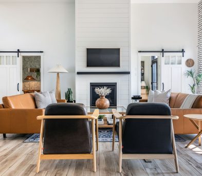
AFTER Living Room
We used layered rugs in the open living and dining area to create distinct zones without interrupting the natural flow. To ground the seating area, we introduced a warm fabric colour for the sectional and paired it with soft leather chairs—both offering a subtle contrast to the vibrant carpet and playful cushions. We kept the decor intentionally spare, relying on carefully chosen plants and art to add life and character while maintaining an airy, uncluttered feel.
This project shows just how much can be achieved with paint, pattern, and styling. It’s proof that with the right choices, a house can feel brand new—without a single wall coming down.
Warm-toned furniture, brass accents, and layered textures were added to complement the home’s existing floors (which we didn’t touch!) and bring everything together.
Click on the arrows (or swipe on mobile) to see the before & after!
Shop: Gus* Modern Cabot Chair in Saddle Black Leather, Gus* Modern Belmont End Table in Walnut, EQ3 Kacia Rectangular Coffee Table in Java, Renwil Rexmund Table Lamp, Loloi SKY-06 Apricot / Mist 5'0" x 7'6", We Fell Asleep Amongst the Flowers" by Ryan Livingstone


Click on the arrows (or swipe on mobile) to see the before & after!
AFTER Dining Room
Rather than replacing everything, we kept their original dining table and sideboard. They work beautifully with the contemporary touches we added, continuing the gold and brass hardware. Because the living and dining room are in the same space, we anchored the two functions with carpets.


AFTER Kitchen
Kim and Stephen's kitchen was already in great shape, so we focused on simple changes to make it feel connected to the rest of the home.
We carried the navy blue from the entrance onto the lower cabinets to ground the space, while the upper cabinets were painted white to keep things feel light and open. We continued the gold toned accents in the doorknobs and pendant light. Finally, the backsplash and barstool were replaced to give the kitchen an update.

Featured: Benjamin Moore Old Navy 2063-10, Benjamin Moore Oxford White CC-30
Shop: Mitzi Paige Linear Pendant Aged Brass, Loloi PAL-03 RP Black /Multi 2'3" x 5' Runner
Click on the arrows (or swipe on mobile) to see the before & after!
Featured: Benjamin Moore Old Navy 2063-10, Benjamin Moore Oxford White CC-30, Mitzi Paige Linear Pendant Aged Brass, Loloi PAL-03 RP Black /Multi 2'3" x 5' Runner
AFTER Family Room
In their family room, we painted the main wall black to make things cozy. Their existing sofa and chair found a new purpose here, refreshed with new finishing touches—a modern chair, side table, coffee table, ottoman, and layered décor.
On the opposite wall, we introduced a calming wallpaper and added a cabinet and mirror to create a simple home bar.
Click on the arrows (or swipe on mobile) to see the before & after!


Shop: Cole & Son Nouvolette Wallpaper in Soot & Snow, Umbra Hub Wall Mirror 37" in Black, Invasive Plants in NB Artworks by Ryan Livingstone, Gus* Modern Belmont Cabinet in Walnut, EQ3 Custom End Table in White Marble Top and Black Base
Now let’s head upstairs to explore the primary bedroom and ensuite!
AFTER Bedroom
Kim and Stephen’s bedroom received one of the most dramatic updates in their home! With dark walls, new furniture and décor, their bedroom feels cozier and moodier than ever.
Even without the new furnishings, by simply changing the layout of the room, the space feels more comfortable and pleasing to the eye. We rotated the bed so that the headboard is against the wall rather than the window. Plus, the new wallpaper makes the bedroom feel more purposeful and luxurious!
Click on the arrows (or swipe on mobile) to see the before & after!
Click on the arrows (or swipe on mobile) to see the before & after!
Featured: Benjamin Moore Twilight Zone 2127-10
Shop: Cole & Son Palm Leaves Wallpaper in Gold on Charcoal, EQ3 Bank Bench, Bailey Chandelier Brass, Monarch Single Dresser in Walnut, Milka Table Lamp


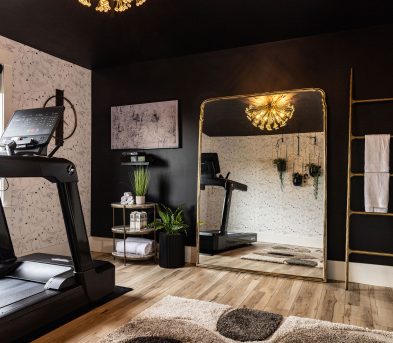
AFTER En Suite
The en suite bathroom received a similarly luxurious refresh. We kept the foundation simple with freshly painted walls and cabinets, but the true transformation came from the addition of a shimmering metallic wallpaper, paired with gold hardware, beautiful round warm wood mirror and accents that elevate the space with a cohesive touch of glamour.
Click on the arrows (or swipe on mobile) to see the before & after!
Featured & available to purchase through Tuck: Cole & Son Hick's Hexagon Wallpaper in Black & Metallic Gold on Soft Olive, Benjamin Moore Old Navy 2063-10, Benjamin Moore Oxford White CC-30, Pi'lo Black Linen Waffle Hand Towel, Brynjar Mirror


Featured & available to purchase through Tuck: Faux Greenery Collection
Ready to bring your home into 2025?
If this transformation sparks ideas for your own space, then we’d love to help bring your goals to life. Whether you’re dreaming of a serene retreat or a room refresh, our TUCK IN interior consulting services can help.


Meet Judith, CEO & Creative Director and Josh, Senior Interior Decorator & Consultant.

Lastly, to stay up to date on TUCK IN news, follow Tuck on social media and also subscribe to our newsletter for more decor insights!