Eight Questions with Judith Mackin: Creating Beauty in John & Catherine’s Great Room Getaway!

Ever wonder what goes into a Tuck Interiors project such as John & Catherine's Great Room Getaway? Where do we begin? What is the process? What challenges do we face? What gets us excited about a project?
In this post Tuck CEO and Creative Director, Judith Mackin, speaks to her process, offers advice on space planning, identifies common mistakes in great room design, and more! Read the full interview below!
1. What was the first element you chose, and is that typically how you start your design process?
The Wrought Iron paint was our anchor. That single decision grounded the entire room and gave us permission to build drama, mood, and depth. Sometimes the first decision is a fabric or a light fixture, but in this case, it was all about that paint. It informed everything that followed—furniture placement, material choices, even art and accessories. It set the tone—literally.

2. Are there any specific light fixture options you might have suggested if the old fixtures didn’t work?
We were lucky—many of the existing fixtures worked beautifully with the updated design. That said, I always have a shortlist of sculptural lighting pieces in my back pocket, especially from Hudson Valley! In the dining room, we chose the Labra chandelier—a perfect juxtaposition of contemporary form with historic undertones. But truthfully, whoever chose the original fixtures knocked it out of the park. A total winner!
3. Did you run into any unexpected limitations with this space that ended up pushing you to be more creative?
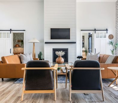
Yes, 100%! The biggest challenge was the “feature wall” in the Great Room. It had two fireplaces, two doorways, a built-in library—and John and Catherine also wanted a TV on that wall. With so many architectural elements competing for attention, it could have easily felt chaotic. Not going to lie—I sat on the floor one day, alone, and just stared at it.
Rather than fight it, we embraced it by painting everything—walls, trim, shelves, surrounds—in Benjamin Moore’s Wrought Iron. The deep tone unified the wall, helped the TV visually disappear, and created a dramatic, grounding effect. From there, it was all about symmetry: treating the two fireplaces like “twins,” styling with intention, and letting the historical features shine.

4. Is there a moment during a design project like this when everything just clicks?
Absolutely. For this project, it was the day the paint went up on that dramatic black feature wall. Suddenly, everything made sense. The boldness of the black paired with soft neutrals, the texture of books and textiles, and all the personal touches—Catherine’s elephant collection, hydrangeas from the garden, heirloom pieces—it felt like the house exhaled and came back to life.
5. How do you balance old and modern furniture without clashing?
Honestly, in a home this rich with historical architecture—grand windows, original fireplaces, a built-in library—there’s no need to add more historical elements. The house is the history. My job was to respect that legacy while offering contrast.
We included subtle nods to the past with two Persian-style rugs and the [Cole & Son] Boscobel Oak wallpaper—an ornate, traditional “damask” print—but the furnishings were decidedly modern. Clean-lined sofas, sculptural lighting, fresh silhouettes. Because let’s be honest—no one wants to sit on a historic sofa to watch TV! That balance between old and new creates a lived-in elegance that feels both grounded and current.

6. How can you make the most of a large space without overly cluttering it?
Edit, edit, edit! A big room doesn’t mean more furniture—it means more intention. In John and Catherine’s Great Room, we divided the space into zones: a main seating area for TV watching, a reading nook, a puzzle corner, and a bar area. Each zone was tied together visually through palette and proportion.
It’s also crucial that when creating two main seating areas, no sofa or sectional cuts off access to the other side of the room. You need flow. And please—always move furniture off the walls, even just a bit! Giving space behind seating changes everything. It makes the room feel gracious instead of staged.
7. What are some common mistakes people make when furnishing a long room?
Ha! Nice segue! One of the biggest mistakes is pushing all the furniture to the edges, leaving a hollow center. It kills intimacy—and let’s face it, you can’t even reach the coffee table! Another misstep is forgetting scale. Long rooms need visual anchors like rugs, art, or bold lighting to prevent them from feeling like a hallway.
In this case, our oversized “art” moment was actually Catherine’s quilt, which she found at a quilt show in Quispamsis. It was visually grounding and deeply personal. That’s the kind of meaningful layer I love to build a room around.

8. What was the thing you were most excited about when designing this space?
Honestly—and yes, I know this might sound like naval gazing—it was the fact that it was The Cleasby. I used to walk by this house on my paper route as a kid, never imagining I’d one day design its interiors. So to work on this historic home for such kind, trusting, and creatively adventurous clients—who welcomed bold colour and playful ideas—was a dream come true.
And they let me push the envelope: deep black walls, intense wallpaper, striking contrasts. It’s a dream when clients say “yes” to the big ideas!